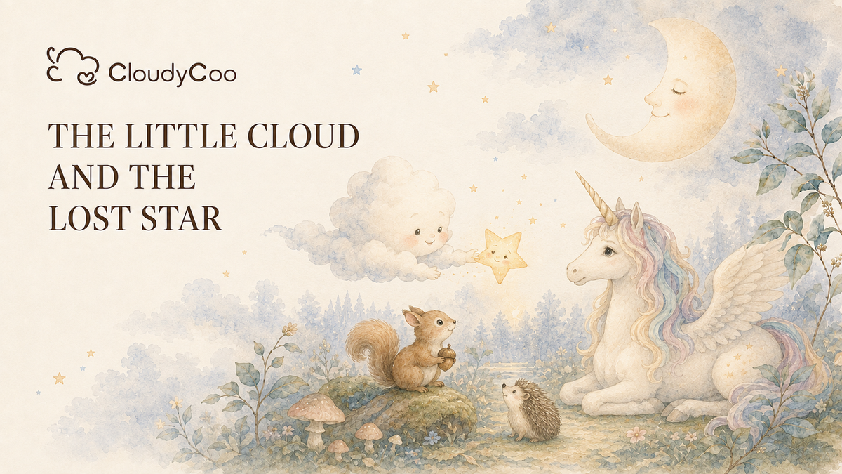
Some prints begin with a color palette.
Some begin with a sketch.
This one began with a bedtime story.
Before this CloudyCoo print became a piece of baby sleepwear, it lived first as a quiet little scene in our imagination: a baby drifting into sleep, becoming a soft cloud, and floating into a moonlit forest where a unicorn, a squirrel, and a hedgehog were waiting under the stars.
We wanted the print to feel gentle before it looked cute. Something soft enough for bedtime, dreamy enough for a nursery, and calm enough to live on a baby zippy without feeling too busy.
So the design started with a feeling: the kind of night where a baby feels safe, held, and ready to dream.
The Story Behind the Print
In the story, Baby falls asleep and becomes a little cloud.
The moon is watching over the forest. A squirrel carries an acorn. A hedgehog steps carefully through the grass. Then a winged unicorn lands softly in the clearing, bringing a small bit of magic to the night.
Together, they find a lost little star and help it return to the sky.
That simple bedtime fairytale became the heart of the print. The moon brings calm. The cloud brings softness. The unicorn brings imagination. The squirrel and hedgehog bring warmth, curiosity, and the sweet feeling of forest friends quietly looking out for one another.
This is what we wanted CloudyCoo’s first fairytale baby pajama print to hold: not just characters, but a tiny world.

(First Draft for Unicorn)
From Story to Hand-Drawn Artwork
Once the story was clear, the next step was turning it into artwork.
The first sketches focused on mood rather than detail. We looked at how the moon should feel, how soft the unicorn’s expression should be, how small the forest animals should appear, and how much empty space the print needed so it could breathe on fabric.
Because this was designed for bamboo baby pajamas, the artwork could not be too sharp, too loud, or too crowded. A baby print has to work differently from a poster or a single illustration. It needs to feel soft from a distance and still have gentle details up close.
That is why we chose a watercolor-inspired direction: soft edges, muted colors, light movement, and a hand-drawn feeling that still feels clean enough for everyday baby sleepwear.

(We tried out a cute style featuring a unicorn holding a star)
Making the Print Wearable
A beautiful illustration is only the beginning.
To become a wearable baby pajama print, the artwork had to be adjusted again and again. We looked at the scale of each character, the spacing between the elements, the balance of the moon, clouds, stars, forest animals, and unicorn, and how the print would look across a full baby zippy.
Too large, and the story would disappear when cut into small garment pieces.
Too small, and the characters would lose their charm.
Too dense, and the sleepwear would feel busy.
Too pale, and the details might fade into the fabric.
The goal was to keep the print dreamy, but still clear. Soft, but not blurry. Magical, but still wearable.
For CloudyCoo, that balance matters. Our prints are made for real babies: for naps, bedtime routines, morning cuddles, diaper changes, stroller walks, and all the little in-between moments parents remember.

(We made significant changes after the initial draft, making the unicorn more realistic)
Testing the SO Sample
After the artwork and print layout were prepared, the next important step was the SO sample.
This is where the design leaves the screen and meets real fabric.
On bamboo viscose baby sleepwear, color can change. Watercolor details may print softer. Fine lines may become less visible. A shade that looks perfect digitally can feel too gray, too warm, or too bright once it is printed on fabric.
So we check the sample carefully:
Does the moon still feel gentle?
Can you still recognize the unicorn, squirrel, and hedgehog?
Are the watercolor details clear without feeling heavy?
Does the print still feel soft enough for baby pajamas?
Does the color work with the zipper, cuffs, and trim?
This step is not just technical. It is emotional too. The sample has to feel like CloudyCoo.

(For the sample printing)
Once the print is refined, it becomes part of the final baby zippy.
That means the artwork has to work together with the full product: the bamboo viscose fabric, the soft stretch, the two-way zipper, the fold-over mittens, the foot cuffs, and the overall comfort parents expect from everyday baby sleepwear.
A print can be beautiful on its own, but on a baby zippy, it has another job. It has to move with the baby. It has to look sweet in real life. It has to feel calm enough for sleep and special enough to become part of a family’s memories.
That is why this design is more than a fairytale scene. It is a small bedtime world made to be worn.
Why This Print Matters to Us
This print represents the way we want to design at CloudyCoo.
We do not want our baby pajamas to feel like random patterns placed on fabric. We want each print to have a reason, a story, and a softness that parents can feel.
From the first bedtime story to the hand-drawn artwork, from print layout to SO sample testing, every step was about making something gentle, original, and wearable for babies.
Because the best baby sleepwear is not only about how it looks.
It is about how it feels in a parent’s hands.
How it moves with a baby’s little kicks.
How it becomes part of bedtime.
How it carries a tiny bit of wonder into everyday life.
And for this print, that wonder began with a baby who became a cloud, a moonlit forest, and a little lost star finding its way home.
Click the image to explore the collection